Lorax
Who or What
Role
Timeline
The Lorax is a mobile app created for the UCI Impact 2022 design-a-thon, where the prompt was to either create solution in regards to social justice or sustainability. With the selection of sustainability, our team determined to creat a solution to make sustainability feel more accessible to college students. Through the fun and playful characterization of the Lorax, we aimed to create a wholesome and engaging community to learn more about sustainability through tracking habits in a fun way. With the gamification of maintaining streaks, there's visible impact on how students are changing the world, one habit at a time.
problem and approach
Prompted to focus in social justice or sustainability, we opted for sustainability as the two of us both considered that the problem with sustainability is it can be overwhelming. In fact, it’s something that’s mentioned often right now, but is too broad of a discipline.
Problem
Sustainability is inaccessible. It’s expensive to buy ethically and organically, complicated with what you should reuse or recycle, and broad in terms of its social, political, and environmental impact.
Upon doing general research through Instagram, the App Store, and available sites we found that there was no resource for everyday people and ways to take actionable steps with measurable progress. The idea of everyday people itself is as broad as the sites, social media accounts, and organizations we found. This led us to focus on the college student demographic.
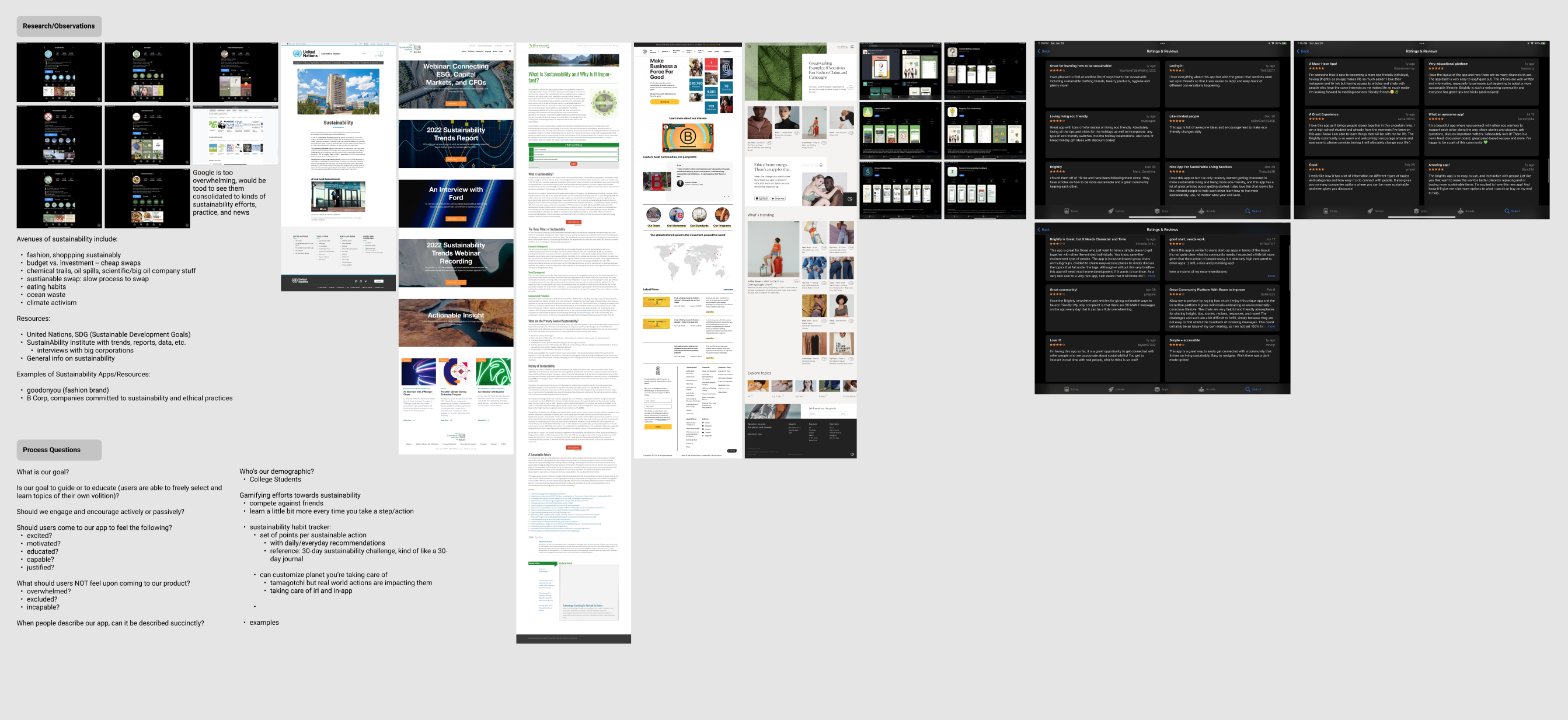
It makes sense as we’re students and we knew that we wanted students to feel excited and educated to make environmentally conscious decisions. This led us to considering a gamified habit tracker that encourages maintaining continuous effort for caring for our planet, kind of like taking care of a Tamagotchi.
insight and focus
Upon defining our overarching solution, we conducted ten user interviews to determine how sustainability is practiced and defined, habits and barriers that prevent active sustainable lifestyles, and what incentives are needed to be more mindful about the environment.
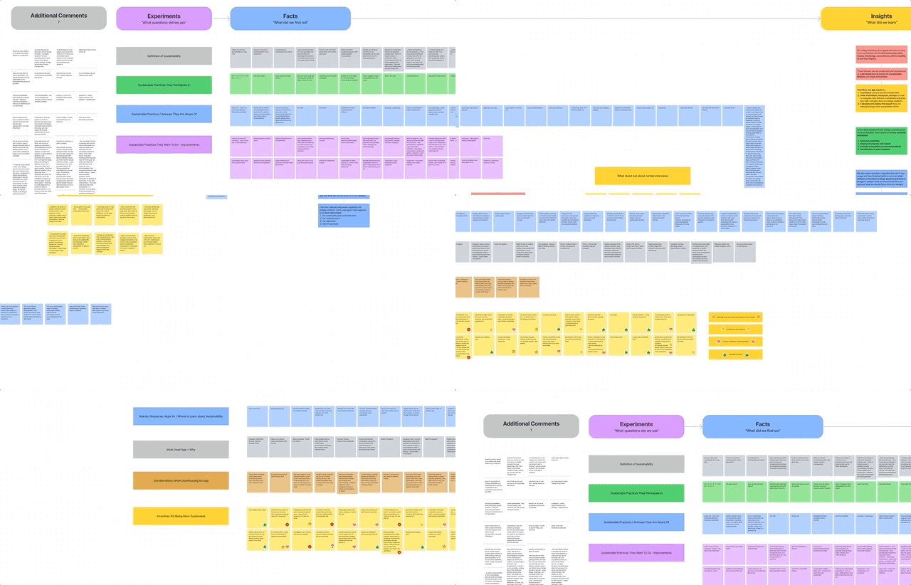
Our findings showed us that what students lacked, what our app need to be, and why do they download the apps they already have.
Lacking
There's no incentive or priority for sustainability because of lack of time, knowledge, convenience, and visible progress. Students are disillusioned by this lifestyle as it seems unattainable.
Need
Our app needs to encourage sustainability by offering information, resources, and tips. All while showing visible progress of actionable tasks and habit. This shows that students are in fact making an impact.
Why
Apps are currently downloaded due to necessity, community and communication, entertainment, and educational purposes. Our app, should strive to achieve three or four of these.
development
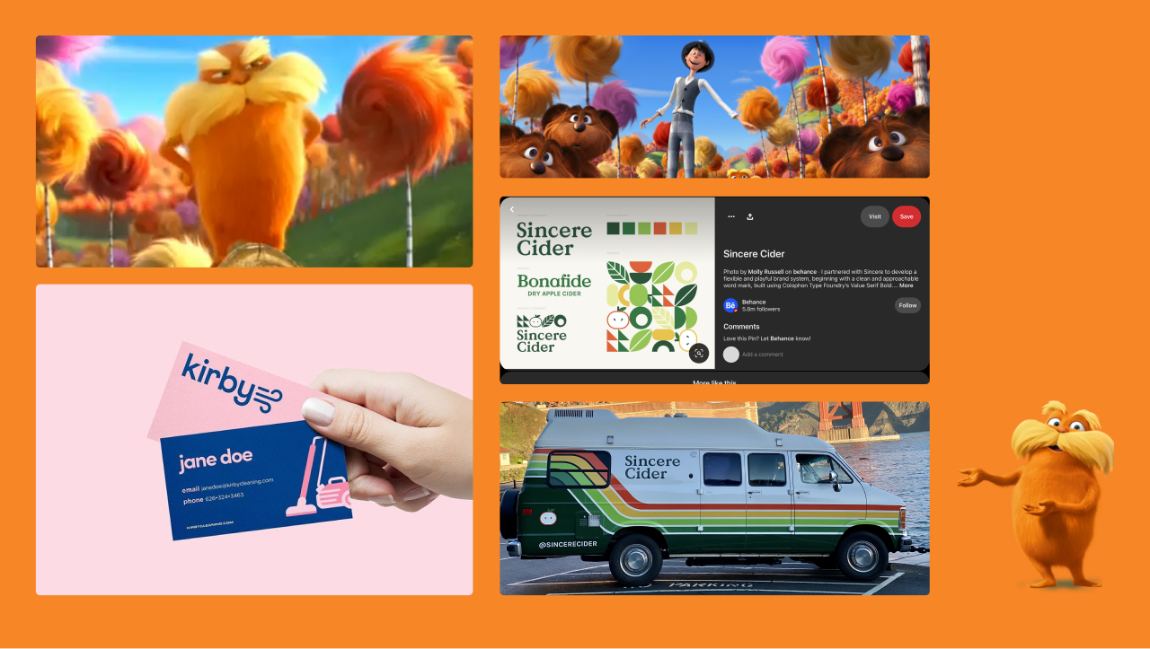
Upon learning what our app needs to do and what goes into downloading an app, we considered a gamification standpoint for college students. Our concept would revolve around the Dr. Seuss Lorax character as he’s memorable, “speaks for the trees”, and has had virality in meme culture in the past.
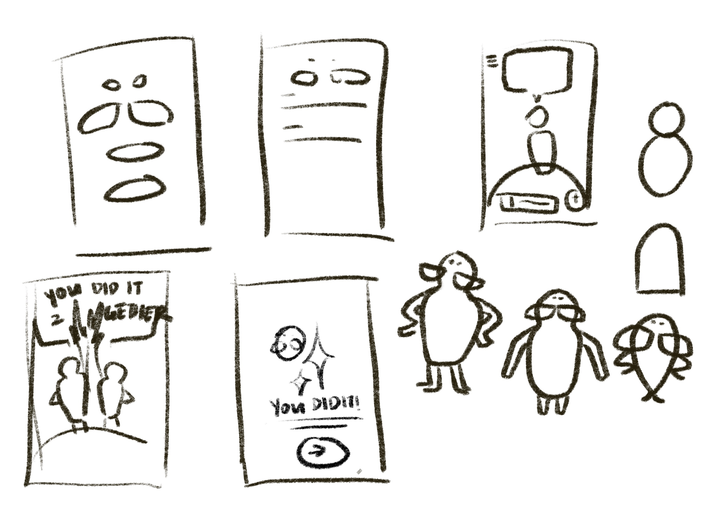
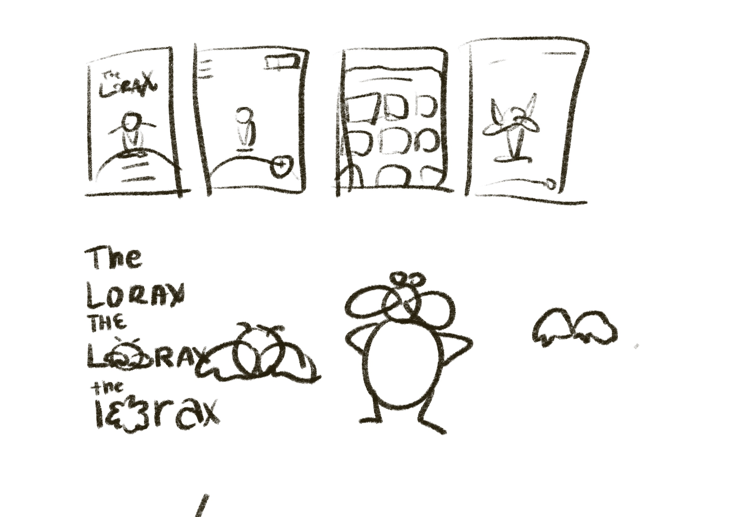
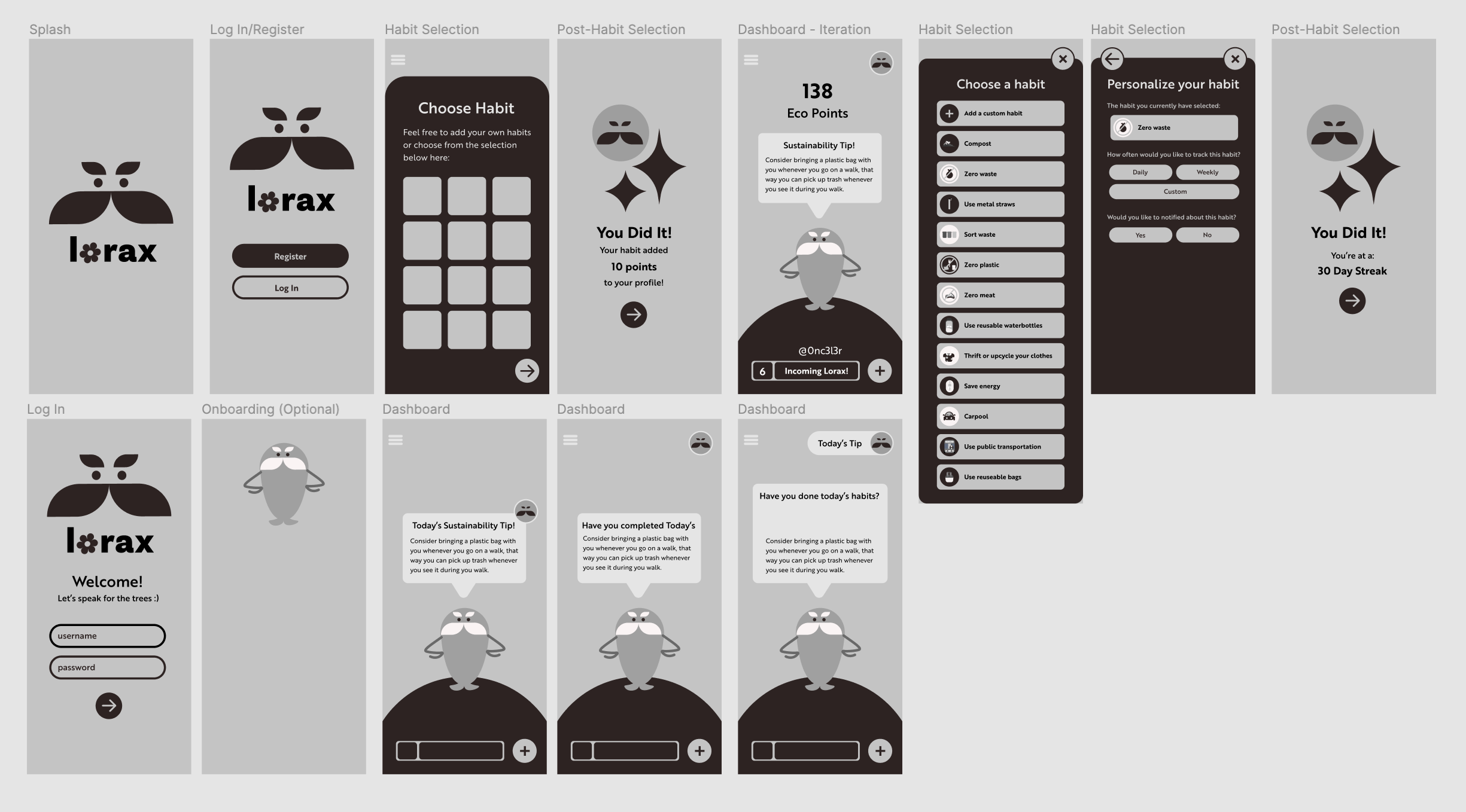
From there I doodled some very quick sketches of the Lorax as well as some wireframes. We concluded based on our user interview to have the following:
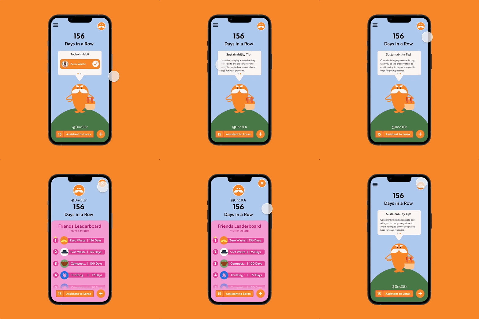
- A leaderboard around a streak and not habits, that would create a sense of community and competition between friends
- Levelling up is a means of feeling proud in continuous habits
- Show visible progress on the homepage
- Provide sustainability tips that could be digested easily on the homepage
I was able to dissect the color palette from movie stills and the children’s book while keeping his features recognizable in tandem with our simple but fun wordmark — emphasizing a playful interpretation of the environment.
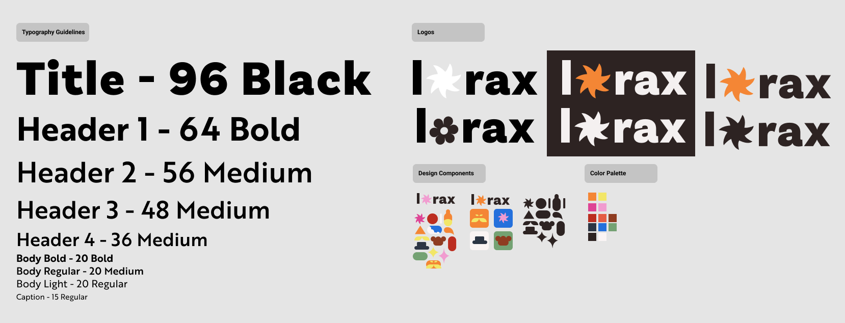
Since our emphasis is on building habits, we decided to also make our own illustrations that would further echo the Lorax branding. Some of which included movie Easter Eggs.

solution
concluding thoughts
While this solution is viable, if we had more time I would like to address:
- we didn’t mention or provide a solution for education beyond swiping through tips → I would consider an education hub with articles or quizzes that can reward users
- we never accounted for the amount of tasks someone may be doing, and so we should aim to incentivize as many sustainable habits as possible
- potentially user testing the finalized iteration, as it is just a habit tracker with a leaderboard and not our proposed solution
key takeaways
- User insight is able to reveal things that you wouldn’t know immediately, like why are users downloading the apps they downloaded — which is something I’ve never considered before
-
There are people who DO want good and specific learning resources but are overwhelmed with today’s current landscape in sustainability
- This was something I didn’t expect regarding the amount of people mentioning Reddit and Quora as places to learn or do casual research
This was my first mobile design project where I employed UX Research methods and I learned a lot from Joanna and from performing the process. This experience taught me a lot about user interviews and how to synthesize the data into focused goals for our project.
More like this
Sampo
A mobile app to help you walk your way to wellness.
The Race to Teochew
A mobile RPG game to learn Teochew.
