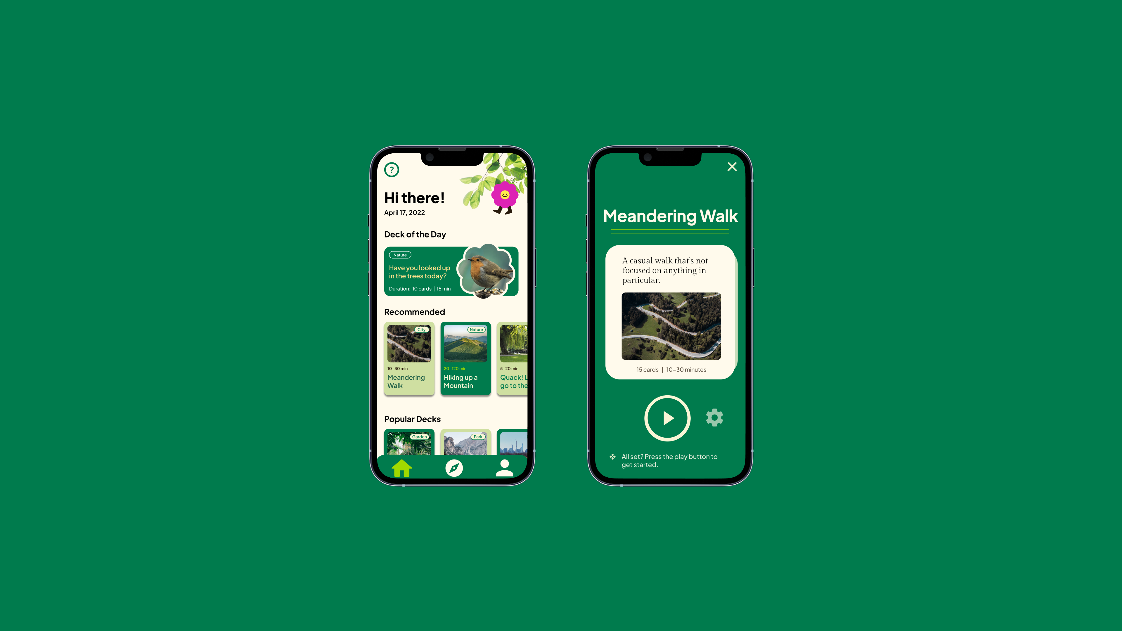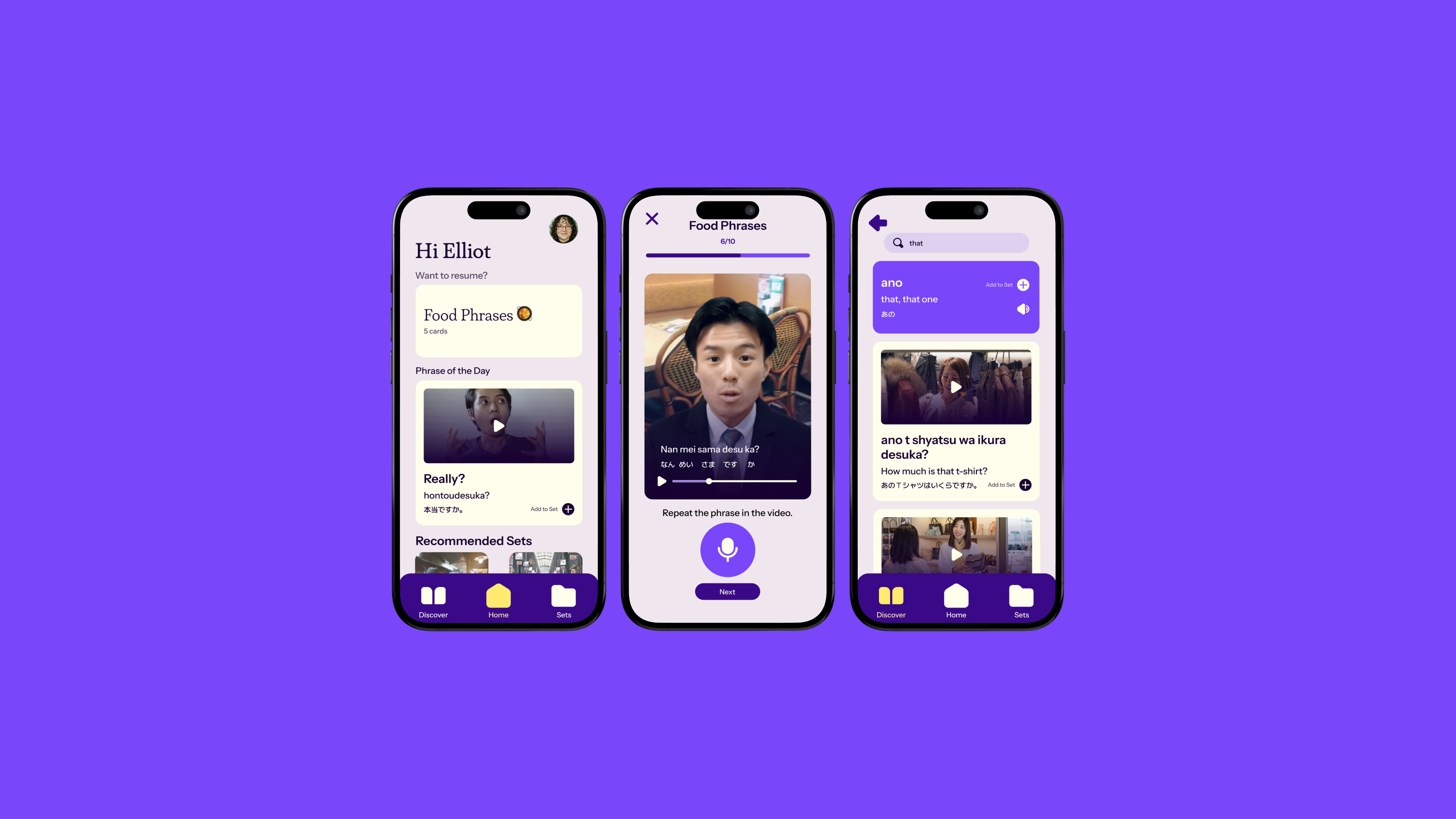
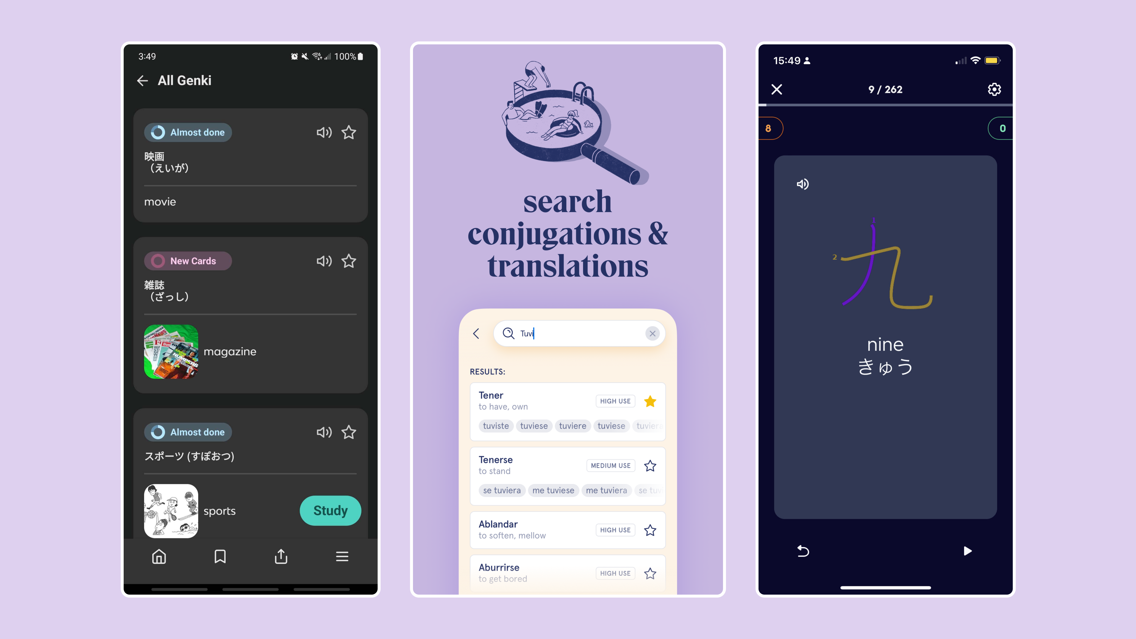
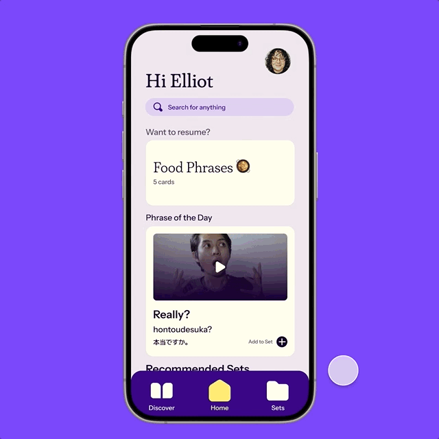
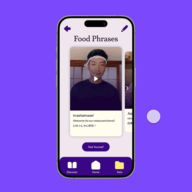
The dashboard, assessment, and dictionary entry screens from the
phraseflash High Fidelity prototype.
A phrasebook & flashcard 2-in-1 app for tourists abroad.
This project is a learning tool designated to aid travelers to learn survival phrases and words they need based on their itinerary. With an emphasis on short-term studying and cramming, a flashcard and phrasebook app were combined to make phraseflash. This solution has proven to be simple and straightforward through repeated user testing, making it a great choice days before a big trip abroad.
With a desire to create an educational tool, Saige and I considered what kinds of tools would benefit us. Both of us spent time this past summer studying Japanese, and they had actually gone during the Fall 2023 quarter. This suggested us to refine a more specific prompt that presumes even with attempts of preparing for a foreign language, how can visitors communicate their basic needs?
How can tourists learn the bare minimum within days before their trip? The goal isn’t to learn the whole language, but be able to communicate what they need during the trip duration.
Upon realizing the problem, we had performed a competitive analysis with data from app store reviews and the sites marketed features — as well as personal experience with these apps.
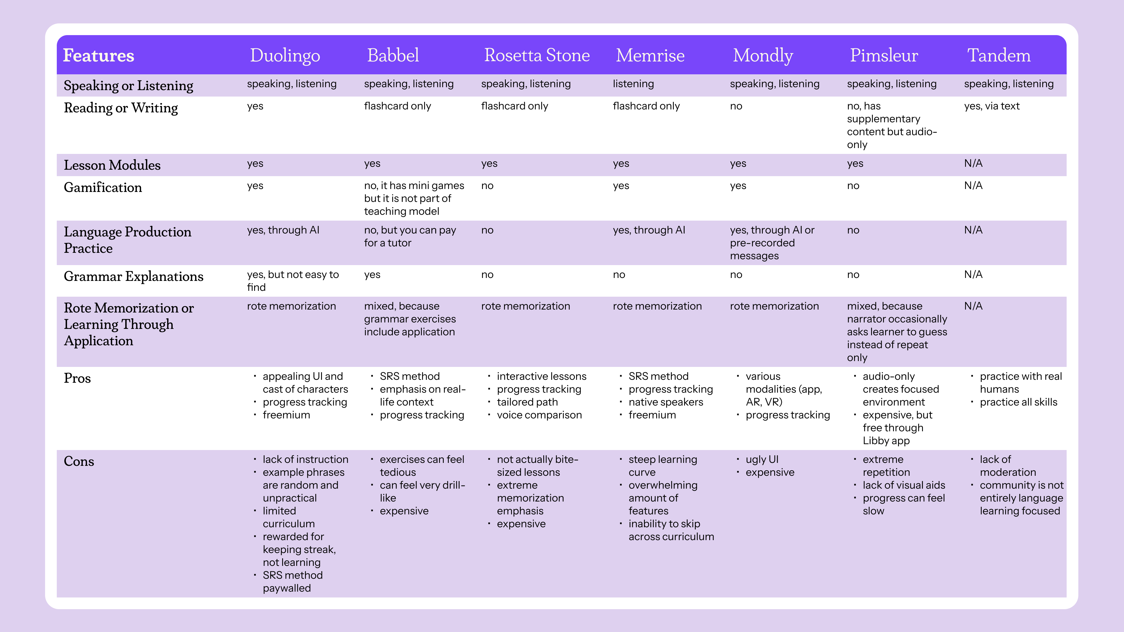
All of the apps in our analysis included some form of module-based learning, rote memorization, and a lack of teaching instruction. And it dawned on us that these are language learning apps, with an emphasis on people that aim to learn language as a habit. But an app type we realized would be a better fit was a phrasebook app. In fact a physical phrasebook would better serve tourists as its physical modality has been a solution prior to phones and the internet. It also has pre-made phrases to use with native speakers, which was the angle we decided to focus on.
We then conducted a user interview with questions asking about peoples’ process to preparing to go on a trip and how they approach foreign language preparation. We also wanted to learn how important what aspects of language learning is important if given a preference as well as people’s current toolbox when travelling abroad.
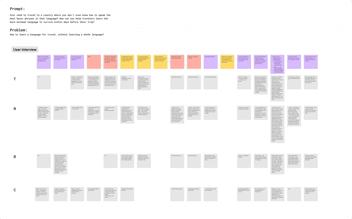
After interviewing, we used FigJam AI to summarize our findings which was basically:
We were able to pivot that people want to cram, as people don’t have the luxury to study or used spaced repetition when communicating abroad. Upon referencing more specific language tools like "Spanish Verbs" and flashcard apps like "Quizlet" and "Knowt" — we determined that we would combine the idea of a phrasebook, dictionary, and flashcard app into one. This would permit an already available database of words and phrases that exist while allowing users to pick and choose what they need for their schedules.
As we established the priority of having an itinerary-based cramming approach, we defined the four main goals of this app:
Use native-speaker videos for phrases from social media to get used to speed and real pronunciations
Find words and phrases in your desired language to find even the most specific of words and phrases
Create and use sets (flashcard deck) that fit your itinerary through premade and custom user sets
Focus on speaking and listening comprehension practices to be able to use immediately during travel
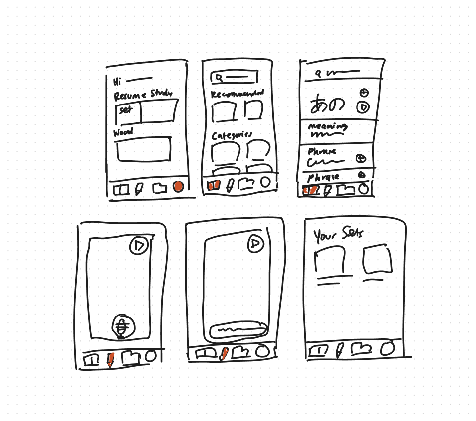
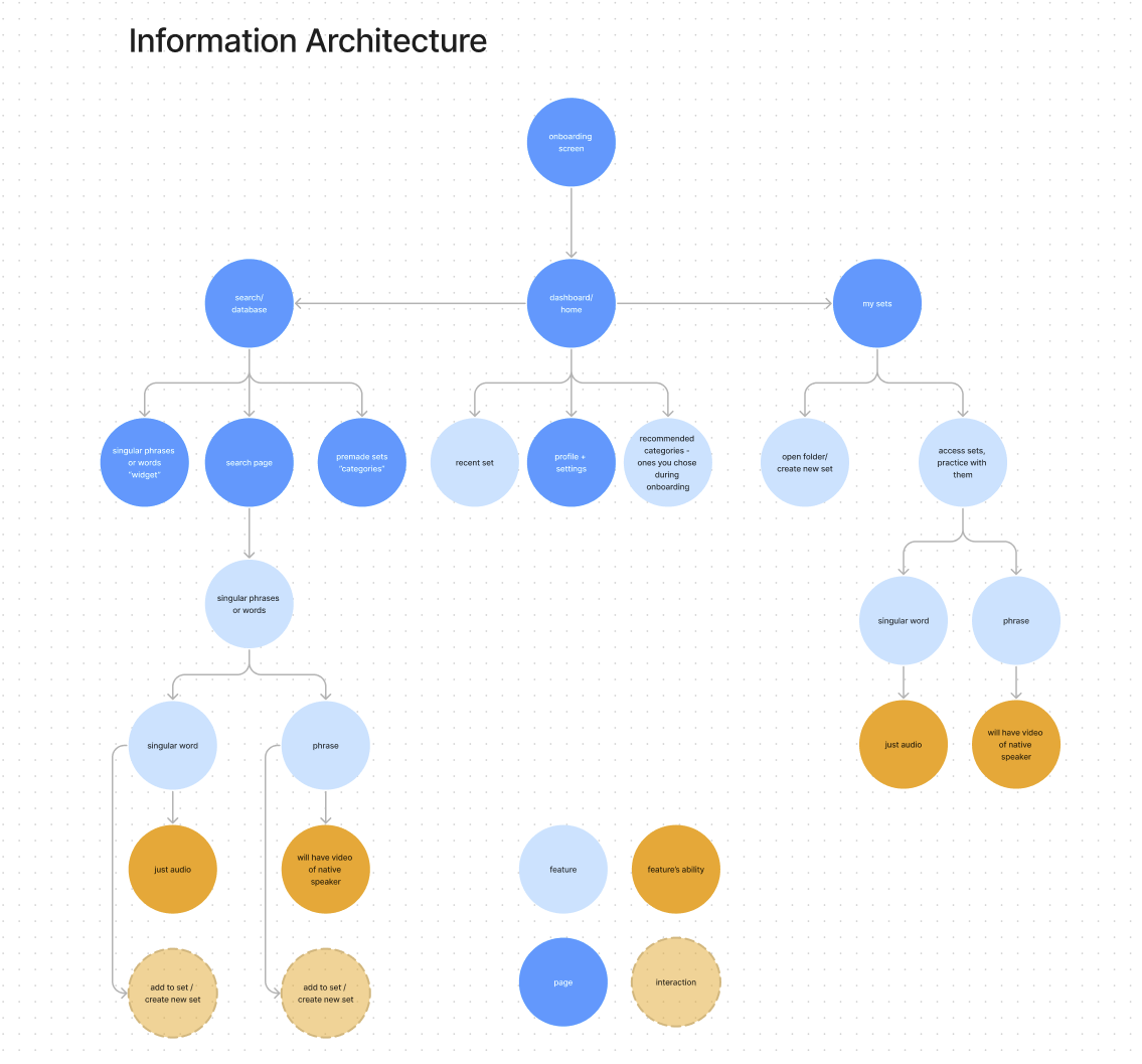
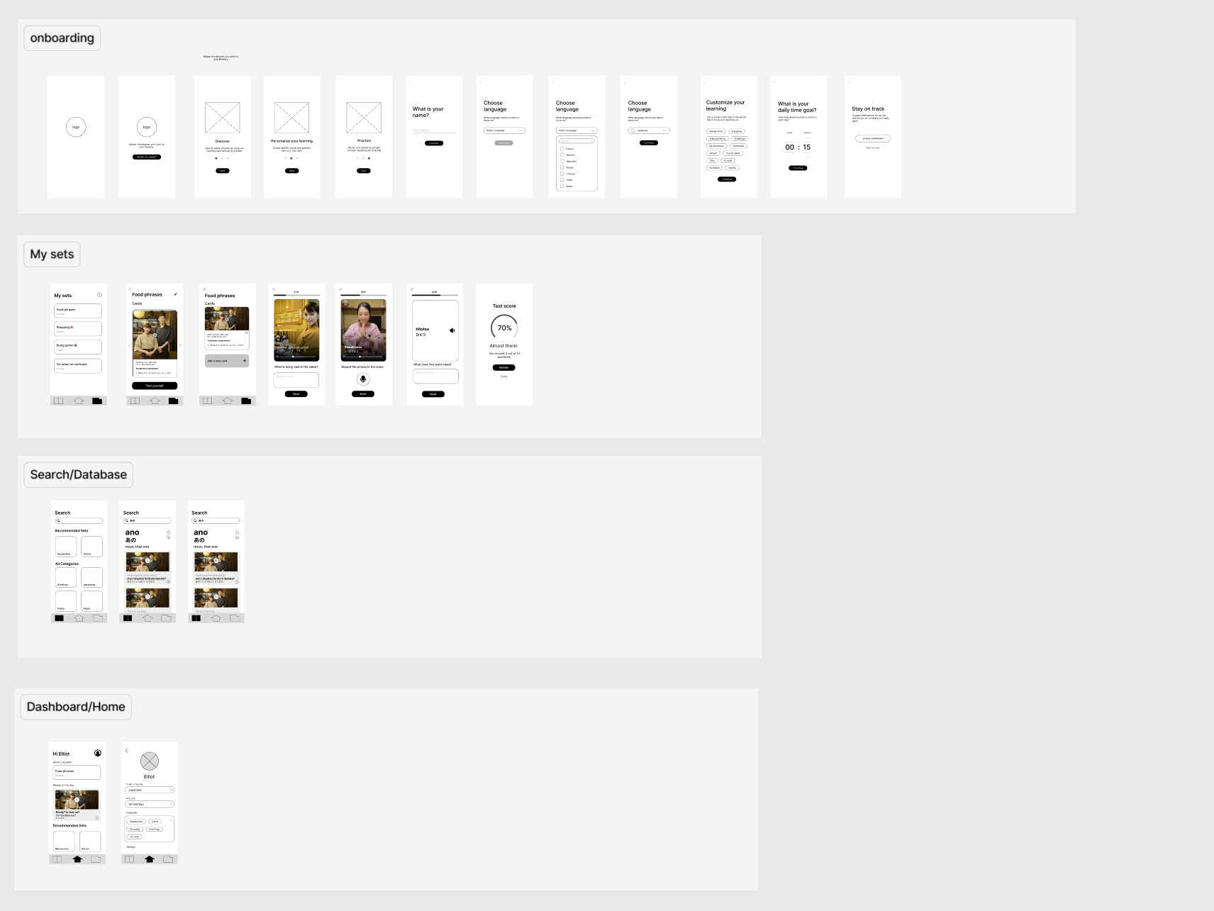
We then did some sketches for the wireframes and scoped out the information architecture. We determined that three main pages would best service the ability to search, review, and assess the easiest. From there, Saige had mocked up and made a basic prototype of the low fidelity frames.
As she did that I began developing the design system, but before we could implement it we did a preliminary user test of our low fidelity flow through Maze. It was the best option given our short period and permitted thorough data analysis in a consolidated way, especially heatmaps which would aid us later.
I started looking at colors first for the system and determined purple would be our core color with yellow accents to create the most contrast but also the purple tints and tones would be versatile for a light mode or dark mode.
From there, the slab-serif Plush font created a studious and academic vibe but Instrument Sans would keep things casual as the main system font. Since Saige and I can read Japanese, we made sure to use M Plus One as the font that best matches Instrument Sans while making sure to use a typeface catered for Japanese script.
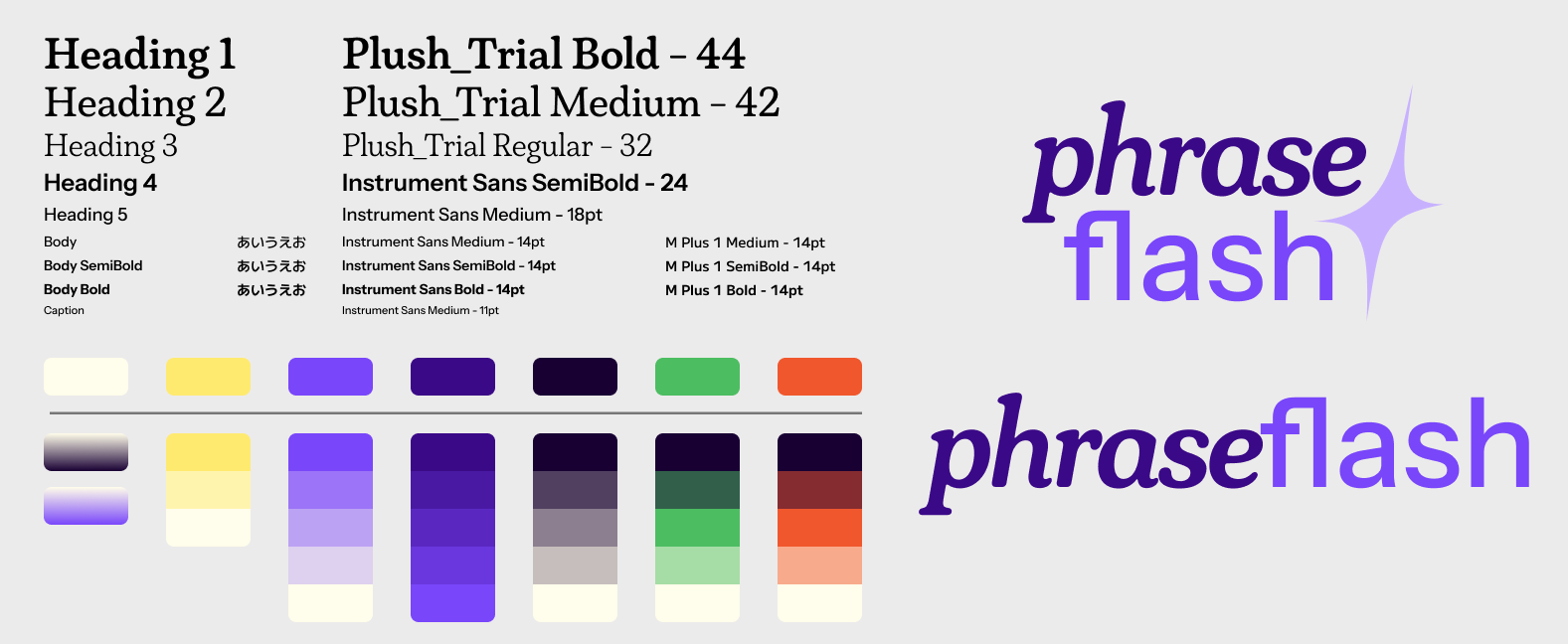
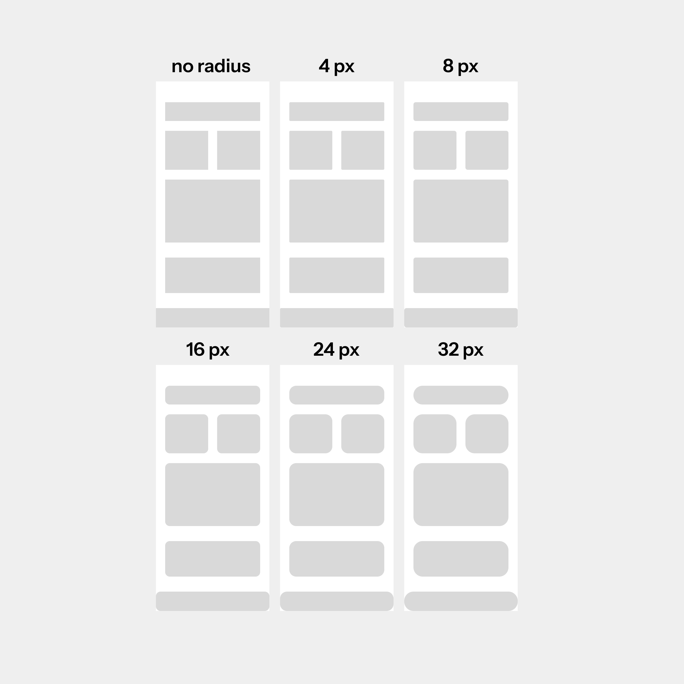
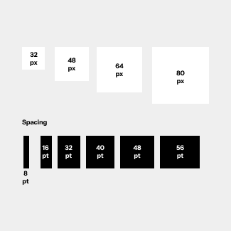
I established that using an 8 pt grid for everything would scale best as from that point we worked from multiples of 8 with a few exceptions with multiples of 4.
The steps in this process allowed me to build a rudimentary design system that was scalable. This was the first time I tried to follow everything by the book, and it proved worthy in the final design.
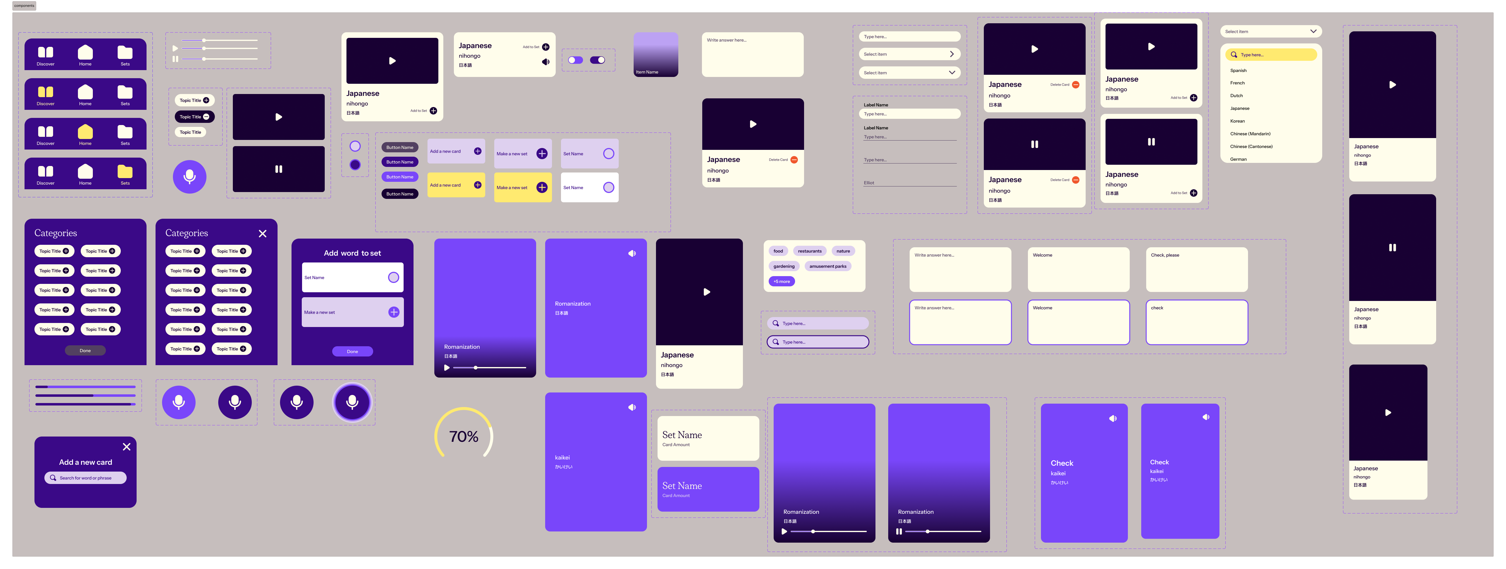
Once we broke down our first user test’s insights we applied this design system to synthesize what worked about the user flow and make user interface adjustments accordingly. Of course from there new components emerged accordingly which led to a full-fledged design system!
We conducted three user tests in total. The first one was using the low fidelity frames prior to applying our design system. And the second and third ones were able to refine and reveal more specific user flow issues as well clear any confusion in copywriting and other expected flows.
In our 1st user test, we found that we need to:
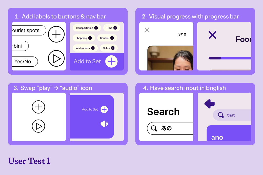
This was a good jumping off point as evidenced through the creation of icons and a more concrete and high fidelity looking design system.
In our 2nd user test we discovered:
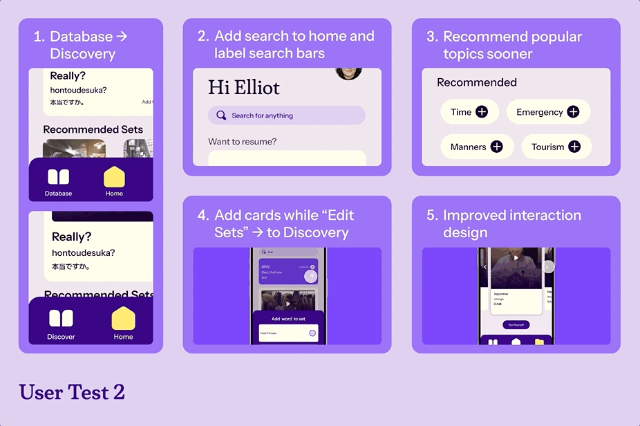
This taught us to rephrase our questions to be more simple and direct. We also considered more paths based on the previous comments regarding alternative preferred entry points to search/add cards.
In our 3nd user test we discovered:
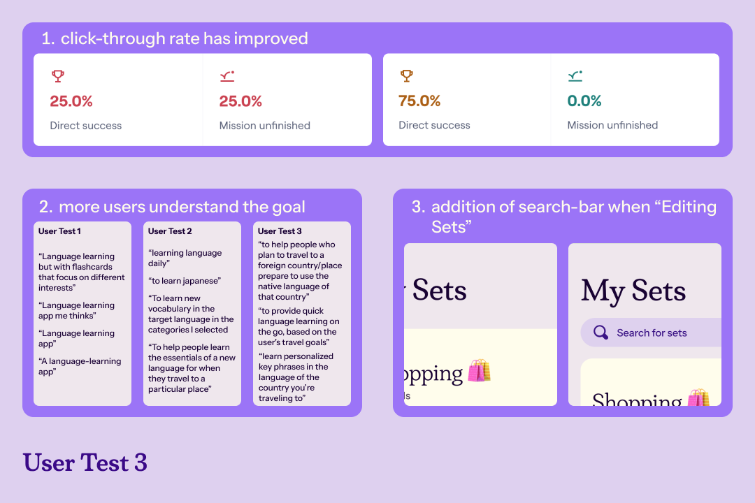
The overall user testing experiences kept teaching us more and more about what we were doing right as well as finding out aspects of the product that went under the radar. While we did not do another user test after this final third one, we still discovered that we had to continue simplifying our questions. Given more time, we may considered doing synchronous user-testing to learn more about the user journey as well as find data in which Maze could not or may have misinterpreted.
And so we finally arrived at our final iteration, after three user-tests, continuously building and iterating our design system, and refining our interactions altogether.
Having a design system in place can really polish the product and provide more certainty during the building process
Regular iteration and user feedback is imperative to making a product for the most specific demographic
Overall super fun project and pleased with our timeline’s deliverable quality and learned outcomes to apply in future design projects. It was an eye-opening learning experience in how to build a design system and seeing the positive impact of focusing on feedback instead of just assuming what's "correct".